Typography / Task 1: Exercises

Ngu Kah Shin / 0347666
Module Name / B' in Creative Media / Taylor's Design School
Task 1 / Exercises
LECTURES / Online class
Week 1
We had a very insightful first lesson over Zoom with Mr Vinod and Mr
Shamsul. We were briefly introduced to the module, notified of the strict assignment deadlines and apprised of where to get announcements and materials- Facebook. During the session, we also had to follow the
instructions given by Mr Vinod on how to build our e-portfolio on
Blogger.

Fig 1.1 Screenshot of lecture class (02/04/2021)

Fig 1.2 Screenshot of lecture (02/04/2021)
Week 2
Mr Vinod went through our sketches and advised on how our work can be improved. We were also put in breakout rooms with other peers to give feedback on each other's works. After that, Mr Shamsul showed us how to
utilise Adobe Illustrator to digitalise our typographical work.

Fig 1.3 Screenshot of lecture (09/04/2021)

Fig 1.4 Screenshot of lecture (09/04/2021)
Week 3
At the beginning of the class, we were instructed to post our digitalised work in the Facebook group. Mr Vinod gave us a set of
questions (see below) which we later used as question guides to
discuss among our peers in breakout rooms.


1. Do the expressions match the meaning of the words?
2. Are the expression well crafted (crafting/lines/shapes)?
2a. Do they sit well on the
art-board
2b. Are the composition engaging? Impactful?
3. Are there unnecessary non-objective elements?
4. How can the work be improved?
Later, Mr Vinod went through some of our work and gave advice on how the work can be improved. Mr Shamsul then showed us how we can
animate our digitalized work on Adobe Illustrator and Adobe
Photoshop.

Fig 1.5 Screenshot of lecture (16/04/2021)

Fig 1.6 Screenshot of lecture (16/04/2021)
Week 4
Mr Vinod and Mr Shamsul first checked everyone's e-portfolio
blogs to make sure we have been updating it as this weighs 30%
of our total grade. They then went through our animated GIF and gave reviews accordingly. Mr Vinod also guided us through Adobe
InDesign to perform text formatting.

Fig 1.7 Screenshot of lecture (23/04/2021)

Fig 1.8 Screenshot of lecture (23/04/2021)

Fig 1.9 Screenshot of lecture (23/04/2021)
Week 5
This week, we had to discuss our text formatting work with our peers in breakout rooms. Below are the questions we had to ask and answer, in order to get reviews and feedback on our work.
1. Is kerning and tracking appropriately done?
2. Does the font size correspond to the line length, leading
& paragraph spacing
3. Is the alignment choice conducive to reading?
4. Has the ragging been controlled well?
5. Has cross-alignment been established using baseline grids?
6. Are widows and orphans present?

Fig 1.10 Screenshot of lecture (30/04/2021)

Fig 1.11 Screenshot of lecture (30/04/2021)
LECTURES / Prerecorded Lectures on Youtube
Lecture: Typo 0 Introduction
Typography is the act of creating letters. Typography can be found in all
around us, from websites to toilet signs!
Font - Individual font or weight within the typefaces.
Typeface - Refers to the entire family that share similar characteristics.
Typeface - Refers to the entire family that share similar characteristics.

Fig 2.1 Lecture notes with screenshots from Mr Vinod's lecture video
(03/04/2021)
Lecture: Typo 1 Development
Note to self: Never use script typefaces in capital letters!!!

Fig 2.2 Lecture notes with screenshots from Mr Vinod's lecture video
(03/04/2021)
Lecture: Typo 2 Basic
Knowing typography terminologies and being able to describe letterforms
is very important for a typographer as well as a student to identify
specific typefaces.

Fig 2.3. Typography cheat sheet from UX Hints (08/04/2021)

Fig 2.4. Typography terminology from Martech.zone (08/04/2021)

Fig 2.5. Em and en lecture notes (08/04/2021)


Fig 2.6 Small capitals and ligature lecture notes (16/04/2021)

Fig 2.7. Different type fonts lecture notes (16/04/2021)
Lecture: Typo 3 Text P1
Kerning is the spacing between 2 individual letters, often used in headings or logotypes. Tracking, on the other hand,
is the spacing between an entire letter group. When applied,
tracking makes the entire word or sentence have equal spacing throughout (not recommended on a whole paragraph).

Fig 2.8. Kerning and tracking lecture notes (24/04/2021)


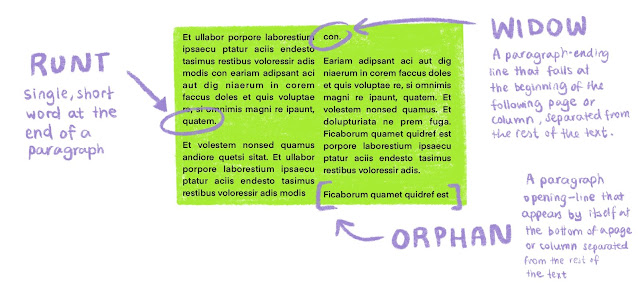

Fig 2.9 Typographical alignments lecture notes
(24/04/2021)
Lecture: Typo 4 Text P2


Fig 2.11 Runt, widow and orphan lecture notes (24/04/2021)
INSTRUCTIONS
HTML LINK:
<iframe
src="https://drive.google.com/file/d/1YKKH8EEy8hiV9DVBzVFBYaZtiPc84OUL/preview"
width="640" height="480"></iframe>
Task 1: Exercise 1 - Type Expressions
We were asked to sketch out some ideas based on the top 7 words given in the
Facebook group. Sketches of the words chosen are to be composed and expressed typographically. I ended up choosing scream, point, slice, spin and wave.


Figure 3.1 Initial sketches (08/04/2021)
Task 1: Exercise 2 - Digitalisation of typography work
After trying to digitalise my sketches on Adobe Illustrator, I realised
some of them just don't work when illustrated on to Adobe, as supposed to
freehand drawing on my sketchbook.

Fig 3.2. My typography attempts on Adobe Illustrator (14/04/2021)
Final submission:
HTML LINK:
<iframe src="https://drive.google.com/file/d/1EXVBVk46TMrMWpqiY7Idqc2YqaRUPCNI/preview" width="640" height="480"></iframe>
Task 1: Exercise 3 - Animating
By using Adobe Illustrator and Photoshop, we had to turn our chosen
typography word into a looping gif.

Fig 4.1 First attempt at creating a simple gif (23/04/2021)

Fig 7.6. Frame artboards on Adobe Illustrator on (23/04/2021)

Fig 4.2 Timeline panels on Adobe Photoshop on 23/04/2021
Final submission:

Task 1: Exercise 4 - Text formatting

Fig 5.1 Text formatting attempts on (29/04/2021)
 |
Fig 5.2 Text formatting attempts on (29/04/2021)  Fig 5.3 Text formatting attempts on 30/04/2021 Final submission: HTML LINK: <iframe src="https://drive.google.com/file/d/17APj0xlWTc4WEo-KO7yLT9FS8dhMtOxQ/preview" width="640" height="480"></iframe> |
FEEDBACK
Week 2 on Task 1
General feedback: Do not use visual/pictorial elements.
Specific feedback: Overall sufficient exploration and
expression matched.
Week 3 on Task 2
Week 3 on Task 2
General Feedback: The radial design for "Spin" is visually heavy, should stick to the simpler version. The E in "Scream"
should be crafted in a way that looks more like a mouth.
Specific feedback: Remember to consider if an element or effect added enhances the expression of the word. Do not add unnecessary non-objective elements.
Specific feedback: Remember to consider if an element or effect added enhances the expression of the word. Do not add unnecessary non-objective elements.
Week 4 on Task 3
General Feedback: Overall smooth animation and my looping GIF was praised.
Week 5 on Task 4
General Feedback: Good layout, no ragging nor rivers. However, I did not achieve the characters required per line, which is to be around 55 to 56. Need to redo it.
Specific feedback: One image is sufficient, and pay more attention to hierarchy.
REFLECTIONS
Experience:
Typography is more difficult than I thought but it is rather interesting nevertheless. I struggled quite a lot because I am unable to use a proper laptop that has functioning Adobe Illustrator and Photoshop for now. Hopefully, I will be able to solve this particular problem as soon as possible as it was interfering with my learning and developing my skills in using Adobe Illustrator and Photoshop. My practical skills on Adobe are still incompetent and needs a lot of improvement. However, Mr Vinod and Mr Shamsul have
been extremely helpful and patient in guiding us throughout!
Observations:
The past 4 weeks made me realise how important time management is. Updating my e-portfolio is a habit I need to build up in order to keep it up to date. There are many rules to follow in order to create a visually appealing and legible piece of work that can convey messages successfully. Details like ragging, widows and orphans should be avoided as these little details could potentially throw off the whole design as they disturb the balance and harmony of a piece.
Further readings:

by Rob Carter, Philip B. Meggs, Ben Day, Sandra Maza, Mark Sanders
A very informative book on typography. Besides reading and looking at visuals of the history of typography, This book contains many visual examples showcasing early historic typefaces, how they developed and changed in styles throughout the years. Basic rules of letterform construction were also covered in the book. I also learnt about the different characteristics of sans serifs. Some have uniform strokes, others have thick and thin strokes which make them have high contrast. Some typefaces could also look more geometric than others. I will reread this again when I begin Semester 2, so I can brush up on my knowledge of typography and this time I would make more detailed notes.
Comments
Post a Comment